Building a strong, recognizable brand starts with a well-crafted style guide. This essential playbook ensures that everyone — designers, marketers, web developers, community managers, and product packaging teams — presents a unified and consistent brand image.
The most memorable brands stick with us because they use the same logos, fonts, colors, and imagery repeatedly. Over time, this consistency makes them instantly recognizable. I’ve seen firsthand how a clear brand guide helps teams stay aligned, ensuring that every touchpoint reinforces the brand’s identity.
So, what is a brand style guide? In this article, I’ll go over the elements of a style guide and share some amazing examples in action to help inspire your next branding project or website redesign (I recommend reading till the end to get some valuable insights from HubSpot’s creative team).
What are brand guidelines?
Brand guidelines, also known as a brand style guide, govern the composition, design, and general look-and-feel of a company’s branding. Brand guidelines can dictate the content of a logo, blog, website, advertisement, and similar marketing collateral.
Picture the most recognizable brands you can think of.
Chances are, you’ve learned to recognize them due to one of the following reasons:
- There’s a written or visual consistency across the messaging.
- The same brand colors are reflected across every asset.
- The language sounds familiar.
- It’s all very organized, and while not rigid, it’s cohesive.
But before you sit down to create your branding guidelines, I’d recommend taking a step back and defining your brand’s mission statement and buyer personas. These strategic elements will help you dive into the tactical components of your brand style guide later.
Brand Guidelines Mission Statement
Your brand guidelines mission statement ensures that all your content is working toward the same goal and connecting with your audience. It can also guide your blog and paid content, ad copy, visual media, and slogan.
Brand Guidelines Buyer Persona
Your brand guidelines buyer persona guides your blog content, ad copy, and visual media, which can attract valuable leads and customers to your business. I suggest creating one quickly with our free persona tool.
The Elements of a Brand Style Guide
A brand style guide encompasses much more than just a logo (although that’s important, too). It visually encompasses everything your brand is about — down to your business’s purpose.
Here are some key elements that I believe make or break a brand style guide, with links to in-depth articles if you need more guidance or info:
- Logo. Logos are a powerful way to determine how your brand is perceived. We’ve got a nine-step guide to walk you through it.
- Color palette. Your brand color palette affects every aspect of your design, especially visual impact and user experience. We’ve got 50 unforgettable palettes to inspire you.
- Typography. Typography plays a critical role on any website by ensuring we can comfortably read and process all its text-based content. If a website’s typography works, we won’t notice. If it fails, chances are we’ll bounce off the page.
- Imagery and iconography. Ensure the best possible user experience with these icon best practices.
- Brand voice. Build your best brand voice using our free brand-building guide.
1. City of Chicago
See the full City of Chicago brand guide.
What I like: Chicago’s brand guidelines rest on the beauty and simplicity of the city’s flag, both in terms of color and design.

I appreciate the level of detail in the branding guide, particularly how it explains the symbolic meaning behind the Chicago Municipal Seal. The guide also provides clear instructions on its proper usage and shows some incorrect examples.
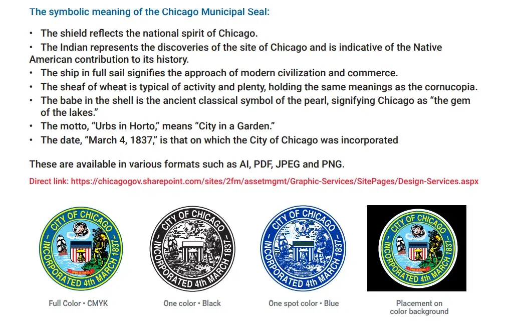
Plus, the tone of the guide is fun and casual — like its acknowledgement of how popular Chicago stars are in tattoo designs.
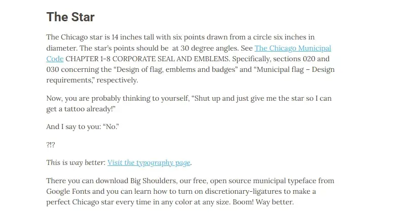
The style guide ensures the city’s visual identity remains consistent across all contexts, as it should for any well-defined brand.
A fun detail: The custom font, Big Shoulders, comes from the Carl Sandburg poem “Chicago,” which gave the city its nickname “City of Big Shoulders.”
2. Olympic Games
See the full Olympic Games brand guide.
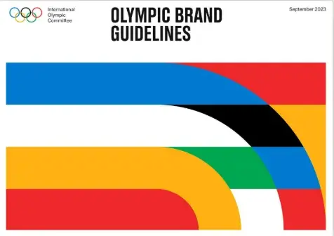
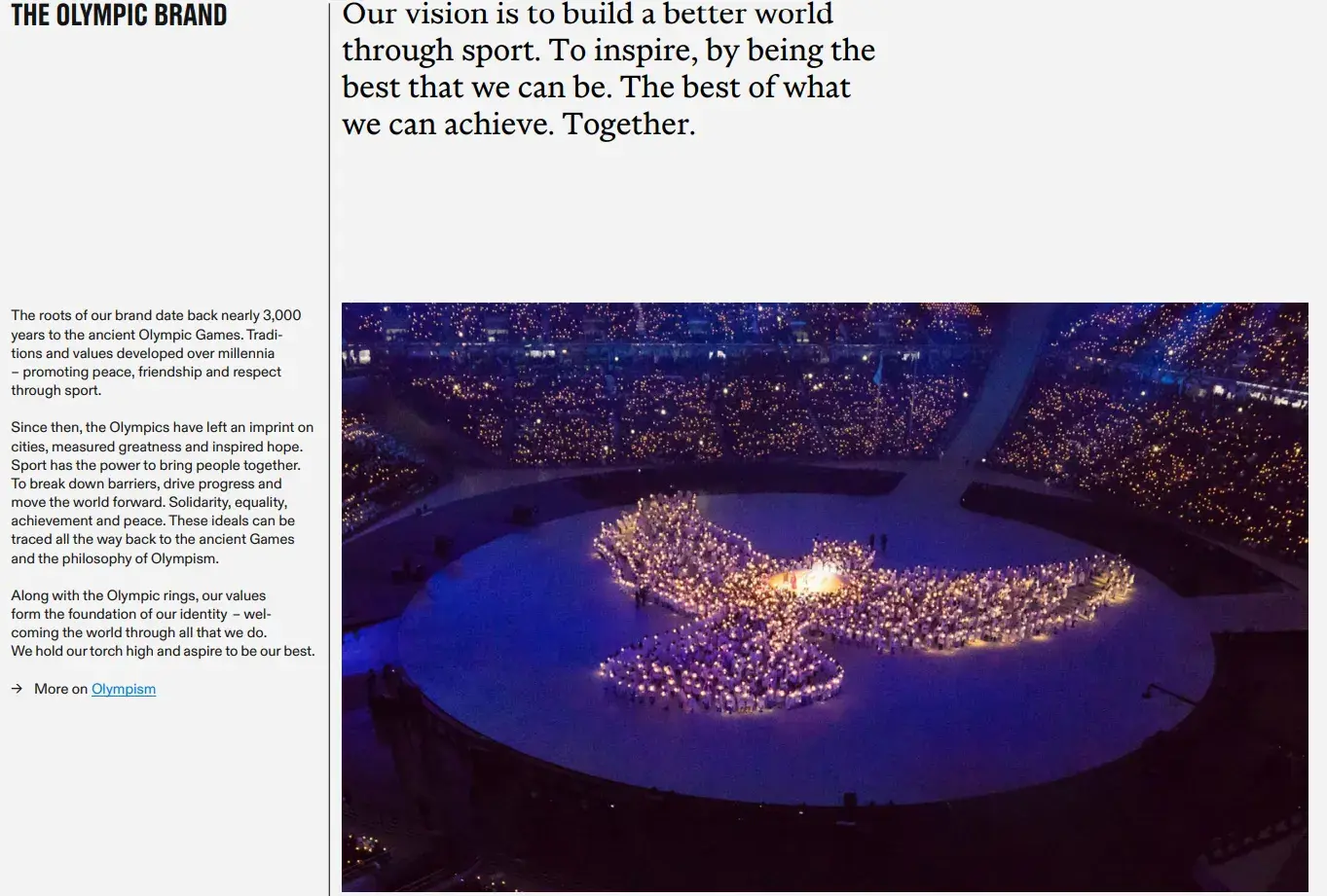
What I like: The Olympic Games still uses the logo and colors from 1913, but the brand was refreshed in 2022 by Ben Hulse. The brand guide is as thorough as any strong style guide should be. It begins with a clear explanation of its mission: to build a better world through sport.
The bold interpretation of the Olympic colors embodies the brand characteristics: hopeful, universal, inclusive, vibrant, and progressive.
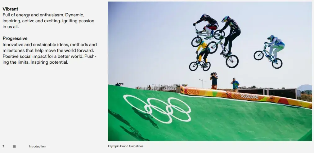
I truly appreciate the structured design approach they’ve adopted, which also aligns with their ideation of being “open, inviting, and inspiring.” I also like how the medal colors are very well-defined.

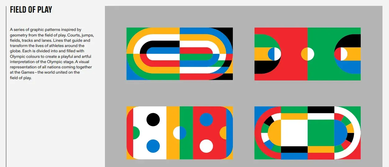
The style guide not only explains the field of play and sporting lines but also provides detailed guidance on combining graphics, adapting them for various applications, incorporating photography, and even creating lockups.
3. Major League Soccer
See the full Major League Soccer brand guide.
What I like: Major League Soccer’s style guide has to include color combinations for 20 teams. To ensure brand cohesiveness, MLS has a single logo mark, the crest, with no design variations. I love how MLS aptly describes it as “powerful, recognizable, and memorable.”
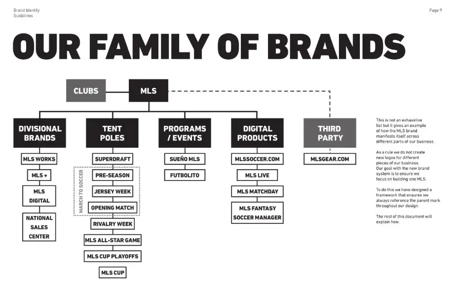
The guidelines show a nice flowchart of the brands associated with MLS and how they represent different branches of the business.
It also includes specific guidance on applying color layers to images and how to “keep it moving” in communications related to MLS.

I feel that the style guide strikes a great balance between flexibility for individual teams and a cohesive league-wide aesthetic.
4. Sonic the Hedgehog
See the full Sonic the Hedgehog brand guide.
What I like: Even cartoons need a style guide. Sonic the Hedgehog’s brand guide includes phrases for each character, which is a fun and novel way to ensure brand consistency.
The best part is that, just like the game itself, the branding is also done in a playful manner. The character size chart is a prime example of this:
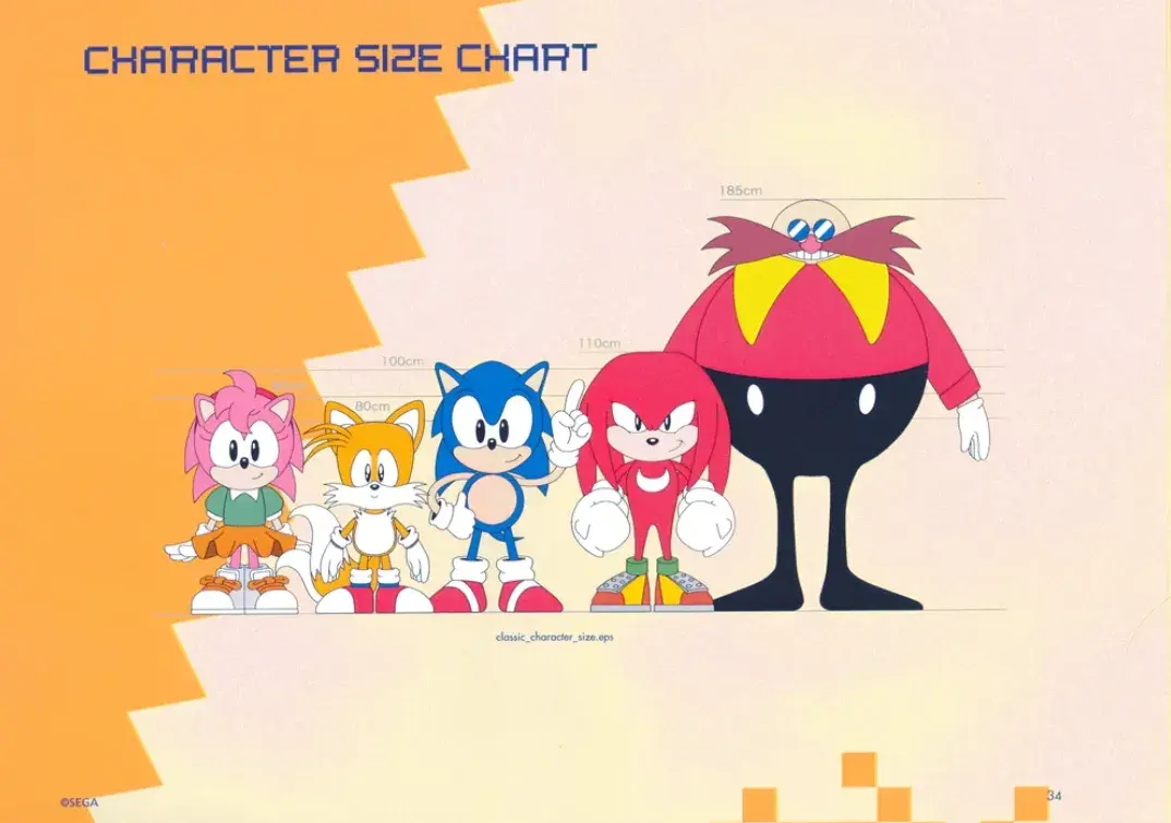
Even the color palette stays true to the game’s vibrant and energetic aesthetic, reinforcing the brand’s identity. It’s a perfect blend of structure and creativity, making sure Sonic and his world remain instantly recognizable across all formats.
5. OpenAI
See the full OpenAI brand guide.
What I like: Unlike other style guides, OpenAI has made use of a video to show their brand guidelines. View it here.
I like how OpenAI has put a lot of thought into the symbolism behind all its color choices. For instance, it uses a lot of black and white in its branding to signify that “OpenAI is an empty vessel that adapts to its content.”
Beyond just showcasing the logo, typography, and fonts, the video effectively communicates the brand’s motto and key message.

Another distinctive feature I liked is that before users can download the logo files from the website, they are required to agree to the usage terms. This way brand usage and compliance is ensured.
Also, I love how the style guide document is continuously refined based on feedback from both internal and external stakeholders. In short, the style guide always remains effective, especially in an industry that is as fast-paced as AI.
6. Reporters San Frontières
See the full Reporters San Frontières brand guide.
What I like: One of RSF’s slogans, “Fight for facts,” is simple but powerful, which is reflected in RSF’s three colors: black, white, and a vibrant pinkish-red. The guide specifies how to use accent colors — red or black should only make up 20% of a design, with white using the other 80%. That reinforces RSF’s spare but muscular branding.
This is one of the few style guides that provides a template for how to apply the brand to presentations.
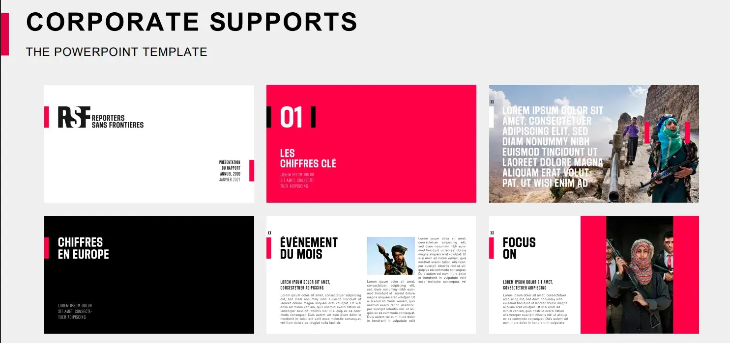
I also like how the guide includes sections on editorial and digital support, ensuring that the brand is applied consistently across both written content and online platforms.
The digital support section addresses how to adapt the brand identity for different digital formats. This way the visual and textual elements are seamlessly integrated into websites, mobile and social media.
7. Czech Railway
See the full Czech Railway brand guide.
A Prague-based studio recently gave government-run rail company SŽDC a new visual identity.
What I like: The Czech Railway’s beautiful color palette is centered around a dark blue and deep orange, and the logo mark evokes railway tracks.
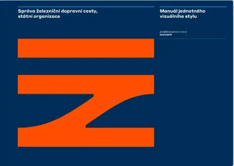
I really love the extended, sans-serif typeface Styrene that has been used and how it enhances the actual look when used on the trains.

The style guide showcases how the branding would look on billboards. I think every style guide should give a complete picture of how the identity translates into the real world.

I also appreciate the modern and functional aesthetic. The combination of the bold color palette, clean typography, and thoughtful design elements makes the new branding visually striking.
8. EPA (1977)
See excerpts from the EPA brand guide.
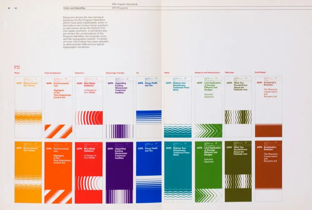
What I like: The U.S. Environmental Protection Agency’s 1977 brand guide is a favorite of graphic designers for good reason. Check out the patterns designated as program identifiers, like “toxic substances,” “noise,” and “radiation.”
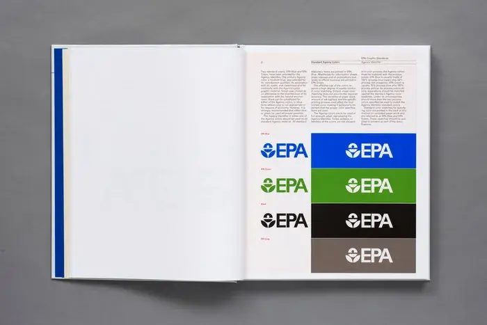
What I appreciate most about this style guide is its clarity in distinguishing the official seal for formal communications. By explicitly stating which seal is reserved for official use, it eliminates any confusion and ensures proper brand representation.

The EPA’s jewel-toned rainbow of brand colors includes a muddy green called “Pesticides Green,” “Radiation Red,” and even a color called, ahem, “Solid Waste Brown.”
9. Docusign
See the full Docusign brand guide.
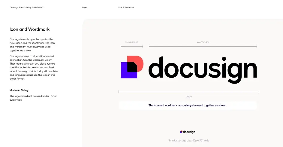
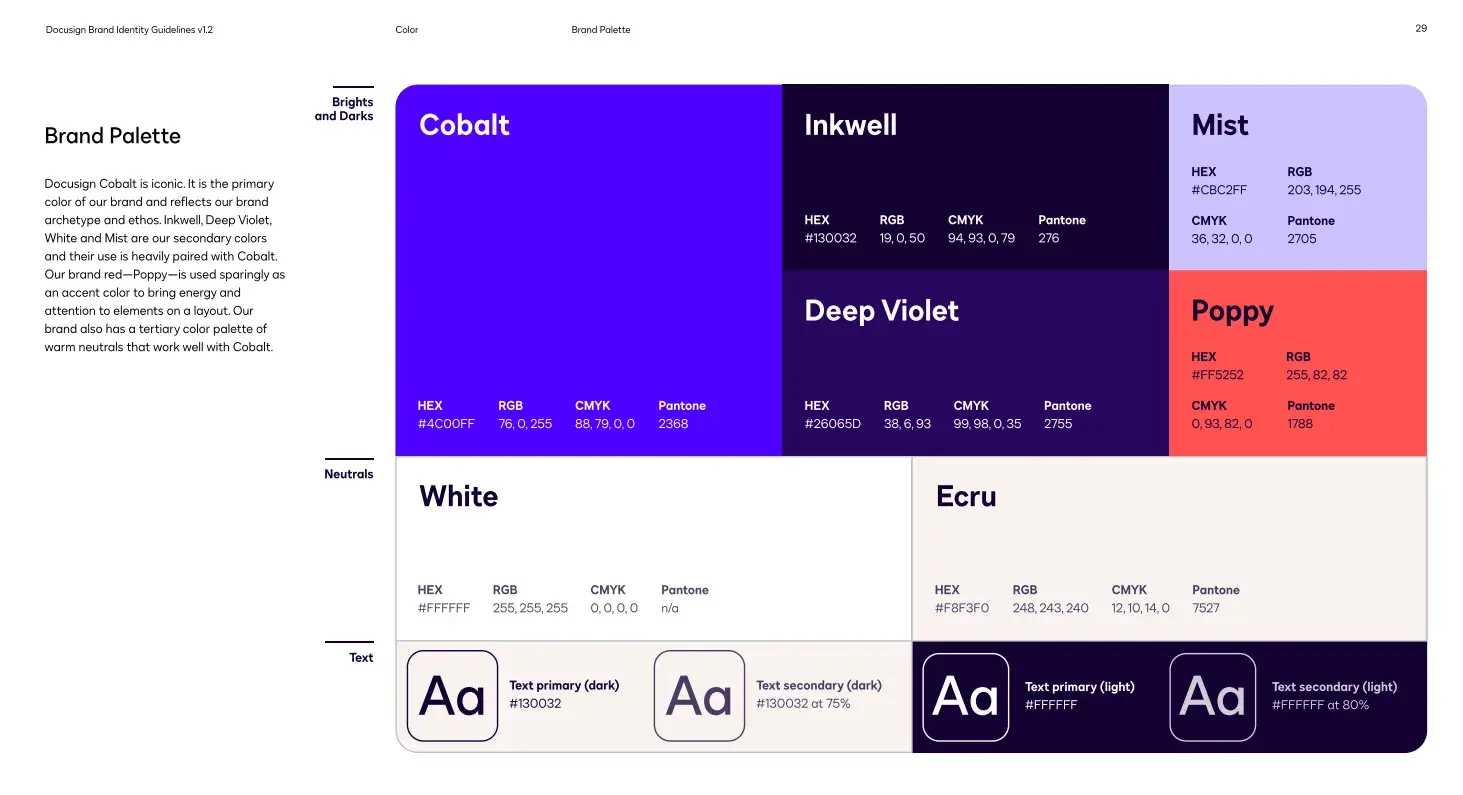
What I like: Docusign includes a page of colored pie charts to demonstrate the correct color ratios.
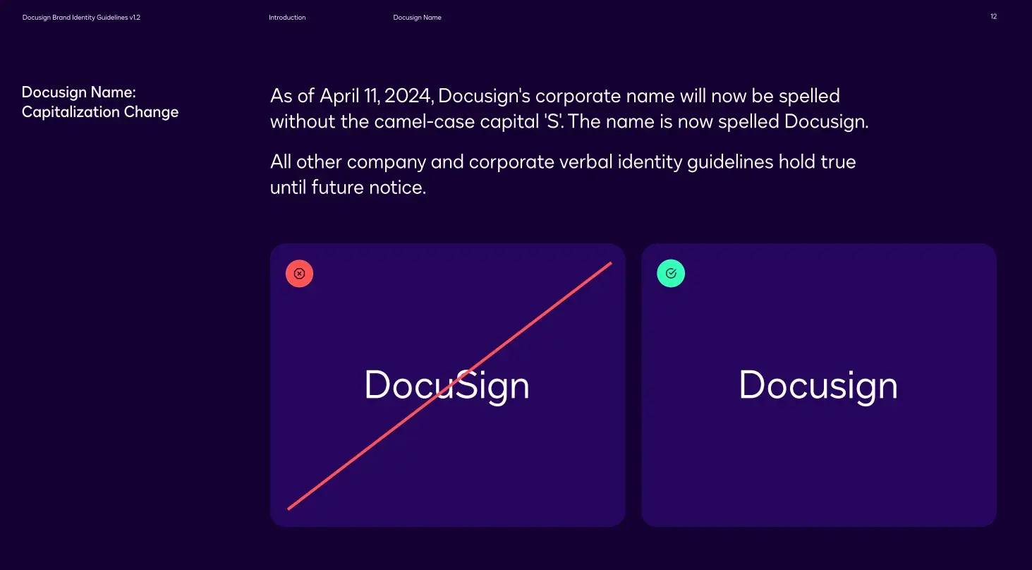
People often misspell brand names, especially when it comes to capitalization. Docusign addresses this issue effectively by clearly specifying the correct spelling and capitalization in the introduction of its style guide.
I feel that Docusign stands out with a zinger of an accent color — a bright coral that beautifully contrasts with the purples in the brand palette. Its brand palette stands out for its clarity and visual appeal.
10. Zagreb Airport
See the full Zagreb Airport brand guide.
What I like: Zagreb Airport in Croatia uses a simple triangle as a building block for complex iconography that references Croatian heritage and culture.

The triangle serves as a versatile design element, appearing in signage, wayfinding, and branding materials in a way that feels both modern and timeless. I love how this geometric approach creates a visually cohesive identity.

I also feel that the style guide thoughtfully balances simplicity across all touchpoints. For instance, safety is an important part of aviation, so the brand guide even shows protective clothing for airport staff.
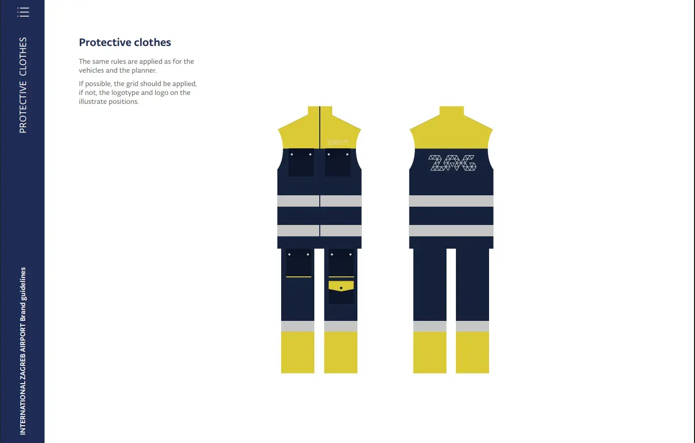
In short, I appreciate how the branding elements are seamlessly integrated into functional applications associated with the airport’s identity.
11. ClickUp
See the full ClickUp brand guide.
What I like: The addition of color combinations in the copy that align with the logo is a nice touch here. I’m one of those people who loves seeing multiple colors as I feel they bring life to any brand guide.

Additionally, I like how they have given a different logo and branding to a product inside ClickUp. The logo files are downloadable (in .svg format) from their website for anyone who wants to use them.

I used ClickUp before coming across its brand guidelines, and it made me appreciate just how much clear guidelines contribute to a seamless experience. It’s no surprise that well-structured brand rules make it easier for front-end developers to implement designs accurately.
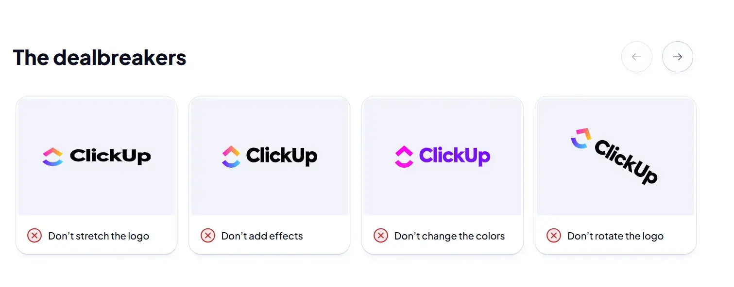
I appreciate the clever use of “dealbreakers” to highlight incorrect logo usage. Presented as a carousel slider on the website, this interactive approach makes the guidelines engaging and easy to navigate.
When creating brand guidelines, the end goal should be consistency in the final product. The clearer the guidelines are, the easier it is for designers, developers, and marketers to maintain a cohesive brand identity across all touchpoints.
12. Qatar Airways
See the full Qatar Airways brand guide.
What I like: I commend the use of the pictograph in Qatar Airways’ logo. They have incorporated simple lines in the background that subtly evoke fluidity. The oryx symbol, a national emblem of Qatar, adds a unique cultural touch while maintaining a sleek, modern aesthetic.

I also appreciate how the brand guidelines ensure the logo’s adaptability across different mediums, from aircraft liveries to digital assets, without losing its distinct identity. They have defined their minimum-size application really well (as shown below).
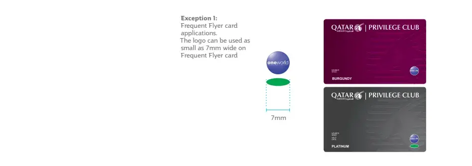
The guide includes specifications for integrating the Oneworld Alliance logo. The co-branding is seamless, as I feel that it maintains Qatar Airways’ strong visual presence. Overall, the entire brand guidelines reinforce the idea of travel and luxury — exactly what it’s supposed to do.
13. Team Canada
See excerpts from the Team Canada brand guide.
What I like: I have included this style guide because of its modern take that adds depth and dynamism. The emblem feels fresh and also does a good job in showcasing the national significance. I feel that to get behind your team and to demonstrate patriotism, you need to connect with symbols that evoke pride and unity — and the designers here have done a great job.
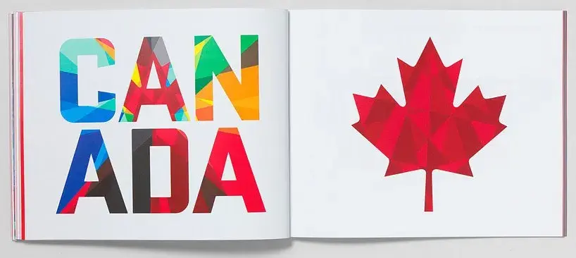
Canada’s red maple leaf could have been a tired symbol, but the designers reimagined it with complex geometric patterns and bold colors.
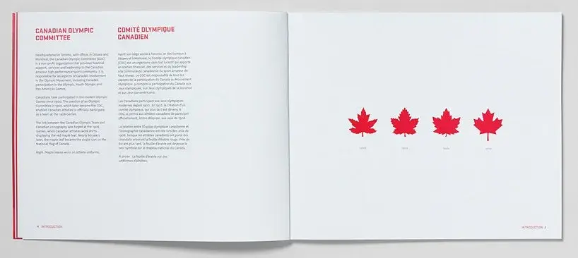
The typeface is detailed and uses the “Winnipeg Falcons Hockey” as an example. Overall, the style guide blends tradition with contemporary design. It reinforced a strong national identity in me (even though I’m not a Canadian).
14. Brasil Governo Federal
See the full Brasil Governo Federal brand guide.
What I like: Brasil Governo Federal’s bold style and brash colors are eye-catching, to say the least. The style guide includes information on how to use the logo in video, which is a brand question that often goes unanswered, in my experience.

A unique thing I like about their brand guide is that they have included how the logo will be in different languages, so it remains consistent across diverse linguistic contexts. This attention to detail ensures that the brand maintains its visual identity regardless of the language in which it appears.
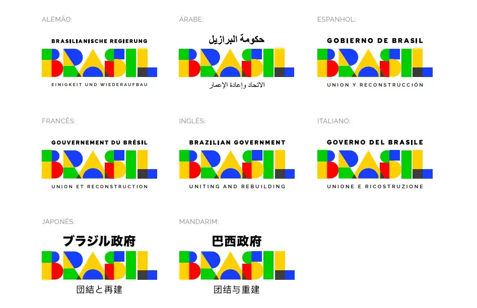
The guide also provides clear specifications on typography, spacing, and color usage, reinforcing a cohesive and recognizable brand presence. I like how they address elements that are often overlooked like application on unstable backgrounds. I think this is a strong example of a well-rounded and practical brand guide.
15. Ryanair
See the full Ryanair brand guidelines.
Ryanair has made itself a brand in recent years, so I decided to see how their brand guide contributes to their fame.
What I like: Ryanair drives customer engagement by relying on witty content. So, even their style guide is an example of it.
I appreciate their design principles and how they actually align with what they believe in. As Denise Lee puts it, “Professionally, I admire the brand. It’s probably one of the best examples of a lighthouse brand.”
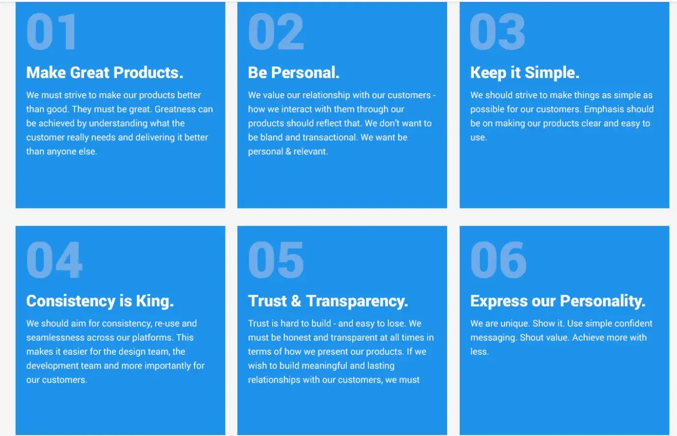
Point #5 aptly applies to them as they are actually transparent in their customer service. They never over promise, and they have established the brand as the “cheapest” airline, so customers’ expectations are set accordingly.
The last part is actually showcased in Ryanair’s marketing. Their marketing is bold, and they aren’t shy in expressing their personality.
16. British Rail
See the full British Rail style guide.
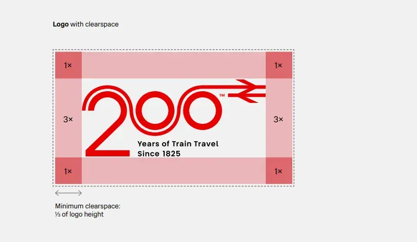
Great British Railways recently updated their brand guidelines to mark the 200 years of train travel since 1825.

What I like: I like how they’ve used multiple core elements to showcase a distinctive look and feel. I like how the brand guidelines have provided the instructions to make use of a reduced-size logo (including a recommendation not to use the strapline “Years of Train Travel Since 1825” with it).
I appreciate how the brand guide has given an example of how to use clearspace and components that contribute to the aesthetic.
For the typeface, they’ve made use of Rail Alphabet 2. I really appreciate how they’ve thought about designers and included an email to request the font files. The brand guide has also given instructions to designers on avoiding special effects such as underlining and shadows.
I love the fresh choice of colors in the secondary color palette: Vivid sky blue, Sunglow, and Emerald.
17. Elizabeth Line, Transport for London
See the full Elizabeth Line brand guide.
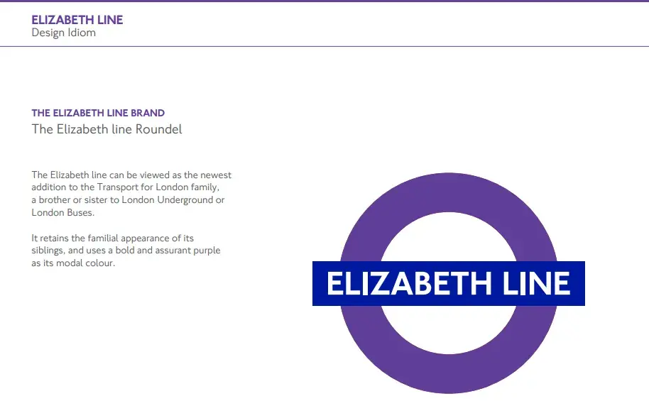
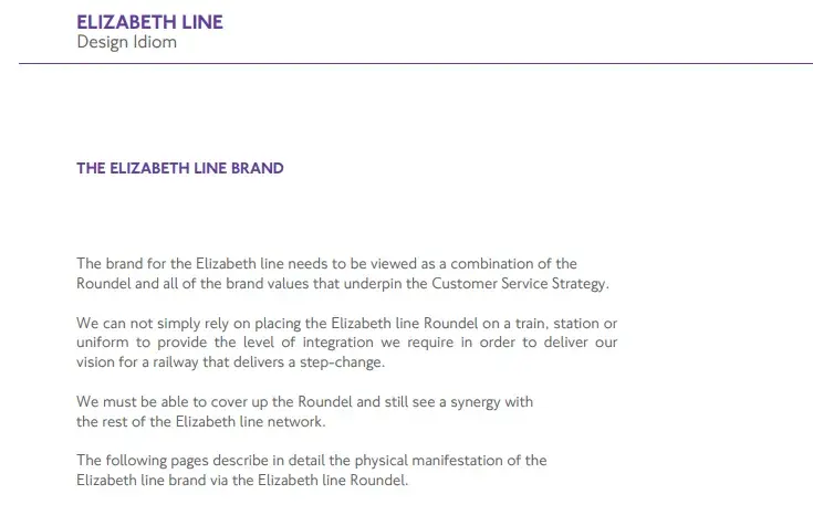
What I like: TfL, London’s transport authority, created a brand guide for its newest addition, the Elizabeth Line.
The Elizabeth Line aims to deliver a high quality experience that’s delivered through consistency of ambience and environment, and I feel that the brand guidelines reflect that well.
It even includes a section on “design idiom flexibility,” which provides guidance on how much Elizabeth Line branding to use on a scale of “localness” to “Elizabeth Line-ness.”

The bold purple color of the newest addition stands out while maintaining a sense of familiarity with Transport for London’s existing network, including London Buses and the Underground. I also appreciate the thoughtful reasoning behind this choice.
Given that colors play a crucial role in distinguishing different transport modes, this careful approach helps prevent confusion and enhances the overall user experience. Here’s how Elizabeth Line stands out from the rest:
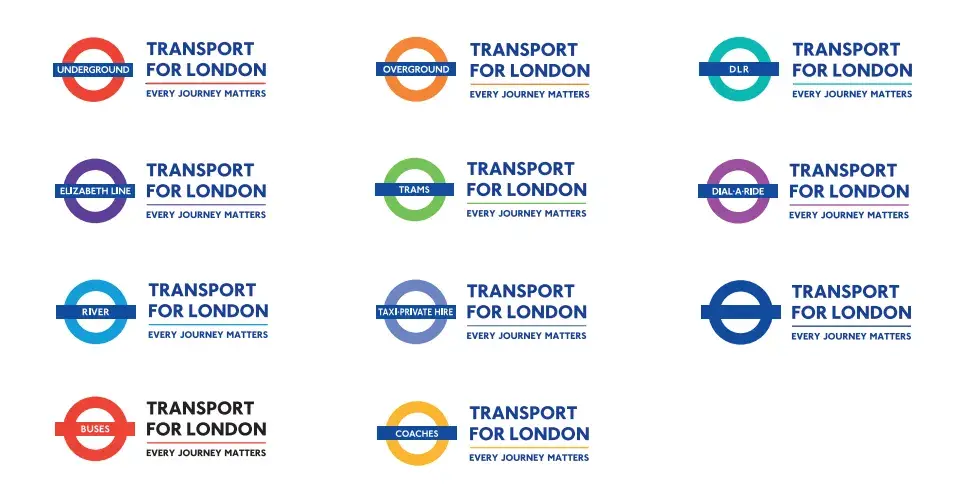
Another strong aspect of the design is the restrained use of core colors. By keeping them simple and intentional, the brand avoids visual clutter and ensures clarity for passengers.
18. Medium
See the full Medium brand guide.
What I like: Medium’s simple brand style guide emphasizes usage of its logo, wordmark, and symbol. The logo contains the wordmark or the name of the company. I think that including the name within the logo helps create instant recognition, making it easier for first-time audiences to remember the brand. Even if a company isn’t widely recognized, this approach is a smart branding strategy.
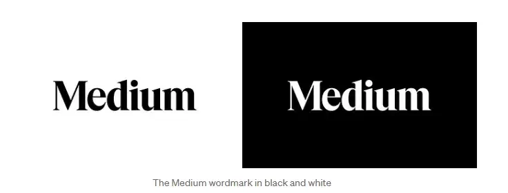
Medium’s logo is the brand’s primary graphic element and was created to feel “confident, premium, timeless, and modern.”

I value the guide’s clean, minimalist approach. Clear guidelines on spacing, sizing, and color ensure consistent branding, while its simplicity makes application easy.
19. Asana
See the full Asana brand guide.

What I like: Asana’s simple style guide highlights its logo and color palette.
It also explains how to properly use the brand’s assets. I love the inclusion of visual examples that show the proper and improper application of the brand elements.

Detailed branding information is present related to partnerships. Many brand guidelines don’t include specific instructions on how their logo should be positioned when paired with partner logos or examples featuring existing partners.
Asana stands out by clearly specifying that their logo should always appear on the left-hand side when used alongside partner logos.
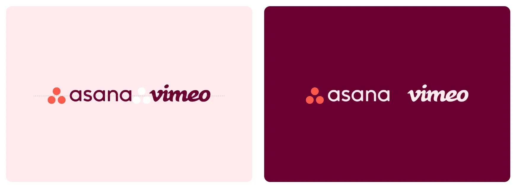
The goal for style guides is to be clear to ensure consistency in how the brand is presented in collaborative settings, and Asana does a great job at it.
20. Paris 2024
See the full Paris 2024 brand guide.
What I like: Paris 2024’s brand identity pays homage to the 1924 Olympic Games through Art Deco-inspired design. The thing I liked best is that designers have applied eco-branding methods to reduce the amount of ink and paper needed for physical materials as well as limit the power and data consumption on digital elements.
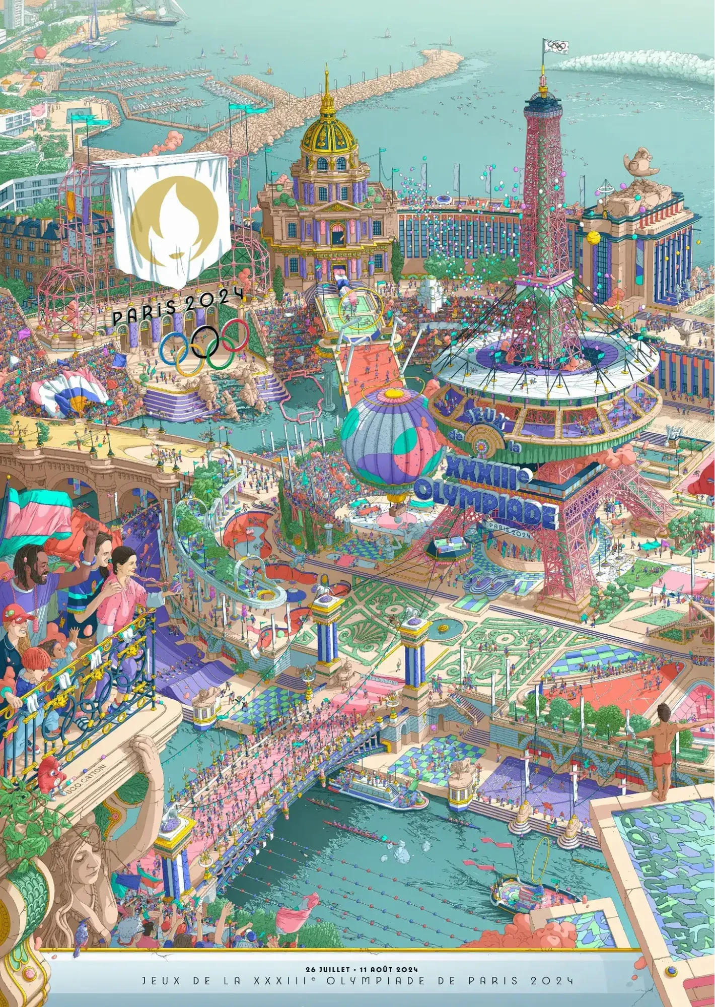
The branding details are just exceptional. It not only shows the iconic elements, such as the Eiffel Tower to represent Paris, boats for the ceremony on the Seine, and the flame that will arrive at Marseille on board the Belem.

I also really like the uniqueness of the Paralympic Games poster. I feel that the use of vibrant colors in this poster adds a sense of energy and excitement.
21. Urban Outfitters
See the full Urban Outfitters brand guide.
What I like: Photography, color, and even tone of voice appear in Urban Outfitters’ California-inspired brand guidelines. Plus, the company includes information about its ideal consumer and what the brand believes in.
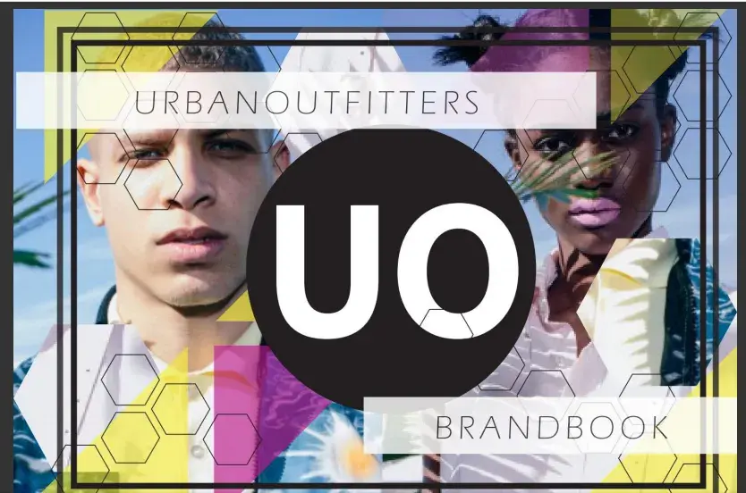
The style guide aptly corresponds to Urban Outfitters’ target market. It defines the brand’s personality and how that translates into communication. Basically, it does a great job of showing that it’s made for a young audience.
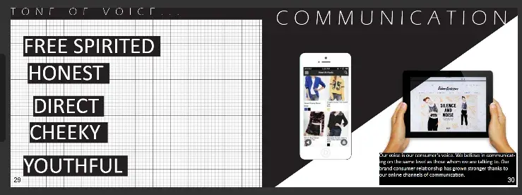
I also like how the guide embraces a slightly unconventional and artistic approach. The visuals and tone feel effortlessly cool, making the brand guidelines an extension of the lifestyle it promotes.
22. Love to Ride
See the full Love to Ride brand guide.
What I like: Love to Ride, a cycling company, is all about color variety in its visually pleasing style guide. The company’s brand guidelines include nine color codes and tons of detail about its secondary logos and imagery.

Brand guides often emphasize visuals, but I believe compelling copy is just as essential. Love to Ride does this exceptionally well. I think the message resonates seamlessly with marketing efforts.
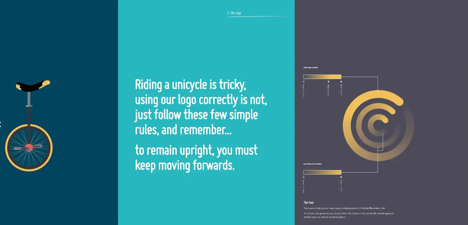
Also, the supplementary assets, such as illustrations and icons, are all very well done. My take is that anything that contributes to a richer brand identity should be given just as much attention as the logo and color palette.
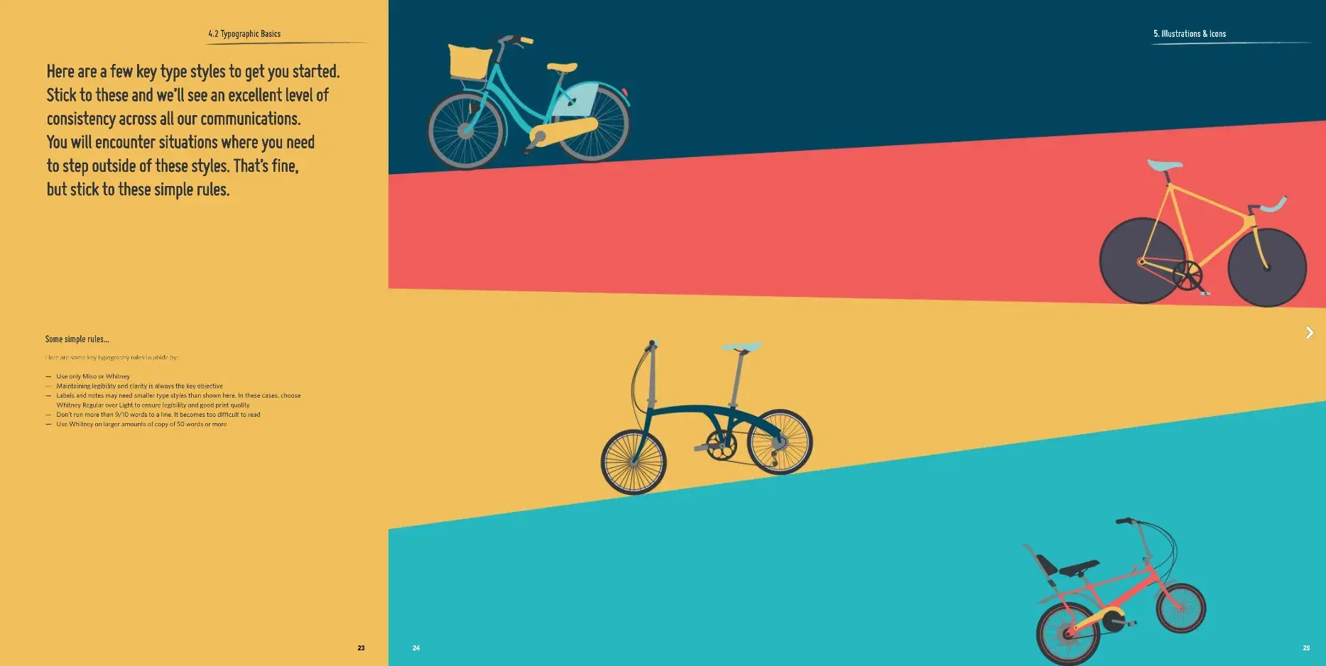
To anyone designing brand guidelines, my suggestion is to remember that when every element aligns with the brand’s personality and message, it creates a stronger connection with the audience.
23. Barbican
See the full Barbican brand guide.
What I like: Barbican, an art and learning center in the United Kingdom, sports a loud yet simple style guide focusing heavily on its logo and supporting typefaces.
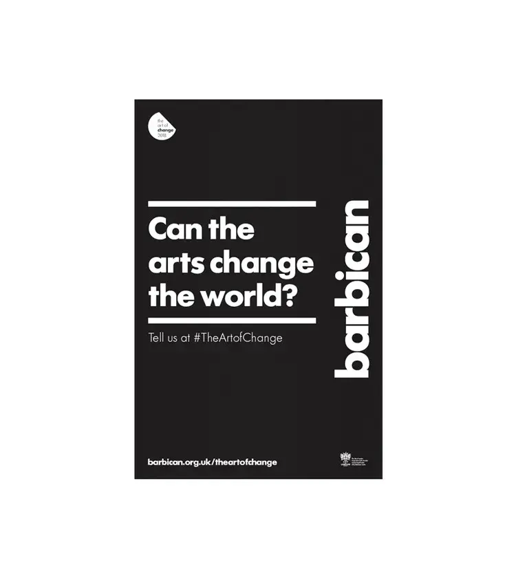
The entire style guide is cohesive and engaging. The copy is brilliant.
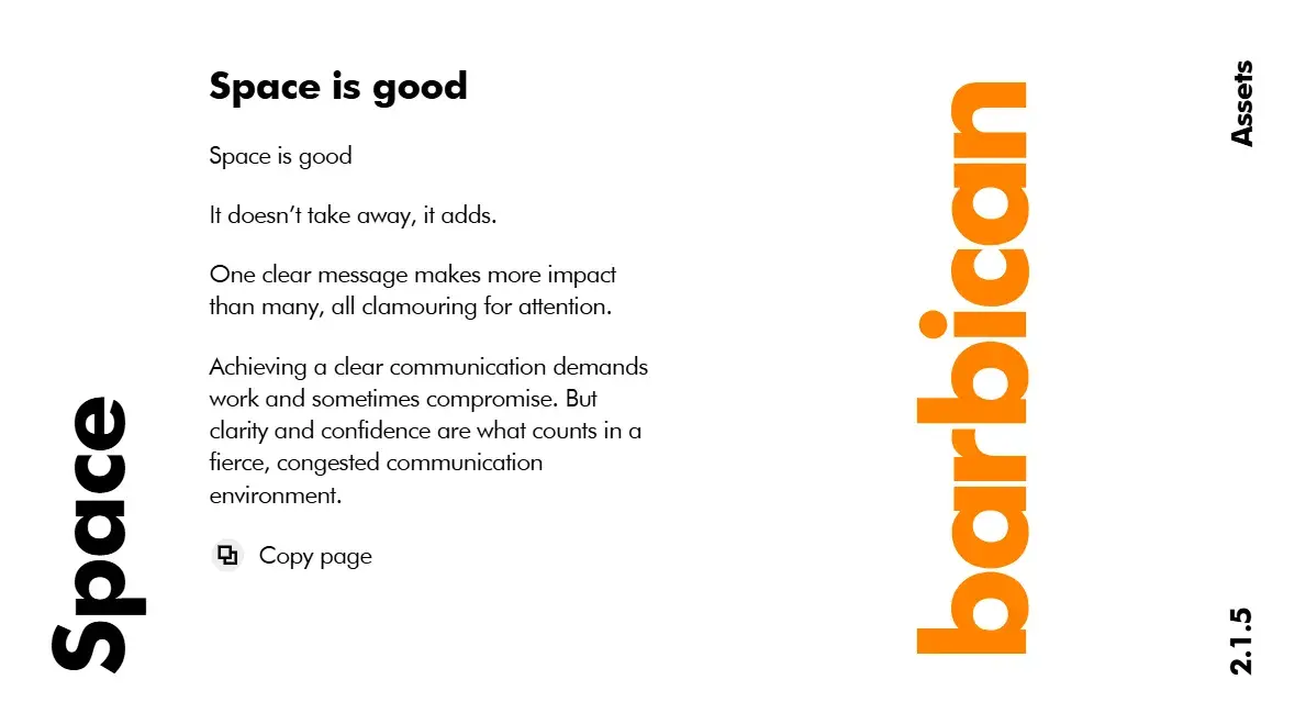
One thing I found interesting is that the guidelines can’t be viewed on mobile devices as the browser needs to be 798px wide. It’s clearly a strategic interesting design choice because it ensures the guidelines are viewed in their intended format without compromising layout or readability.
This brand style guide includes a convenient copy button at the end of each page, making it effortless for designers and users to replicate and apply the content seamlessly across various platforms.
Another standout feature is the bold use of typography, which perfectly aligns with Barbican’s modern and avant-garde identity. The clean yet striking design approach makes the brand instantly recognizable across different media.
24. I Love New York
See the full I Love New York brand guide.
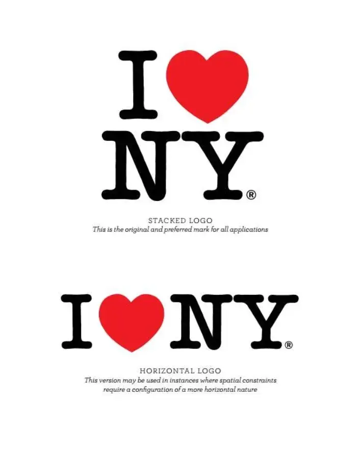
What I like: Despite its famously simple T-shirts, I Love New York has a brand style guide. The company begins its guidelines with a thorough explanation of its mission, vision, story, target audience, and tone of voice. Only then does the style guide delve into its logo positioning on various merchandise.
Some brand guides tell the story behind the brand or the reasoning behind design choices, and I Love New York is one of them. The inclusion of a brand pyramid is very thoughtful and resonates with modern values.
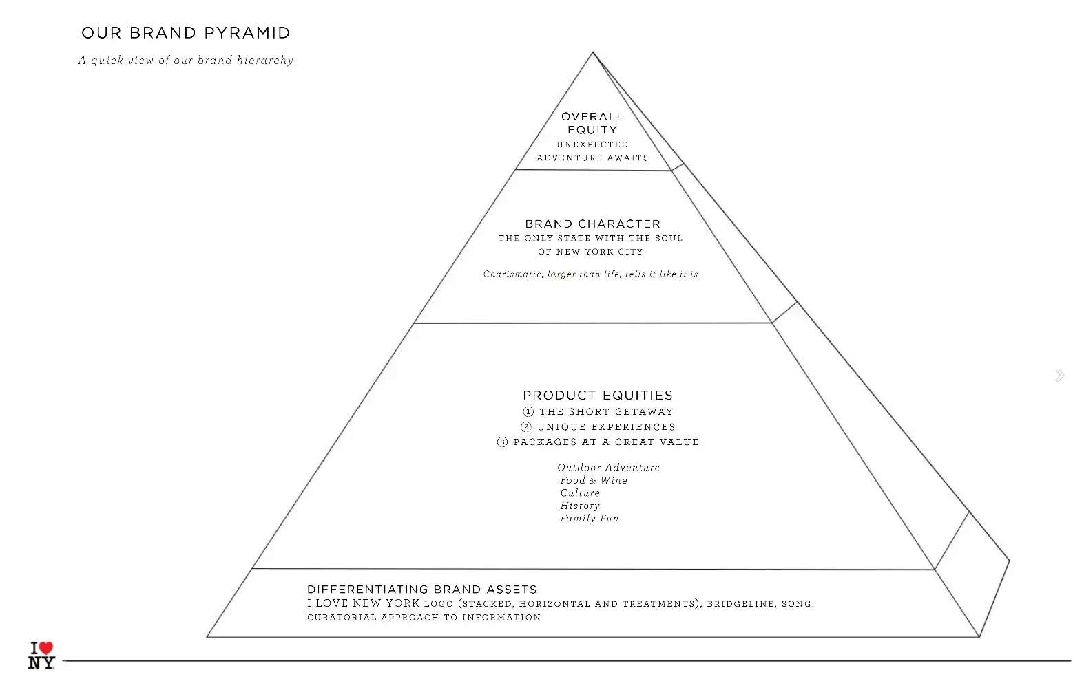
My recommendation is to try to always connect the visual identity to the brand’s values. This way, you’ll end up building a superb style guide.
25. TikTok
See the full TikTok brand guide.
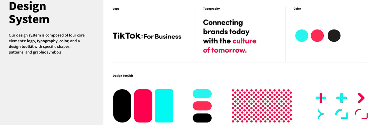
What I like: TikTok’s style guide isn’t just a guide — it’s an interactive brand book. First, it provides an in-depth look into how it brings its brand to life through design.
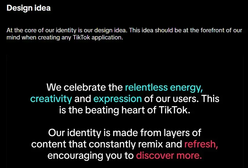
Then, it gives an overview of its logo, co-branding, color, and typography. The downloadable assets are a great touch. Everything you need is available directly within the guidelines, so there’s no need to search through separate folders or tools.
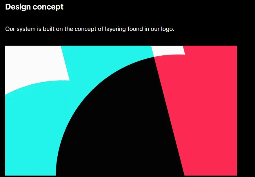
I love how an entire section is dedicated to creating content within the TikTok app. This makes it easy to understand how to design for the platform.
I also appreciate how they’ve included co-branding considerations, recognizing that many brands use TikTok for marketing. This shows a strong awareness of how the brand functions in real-world collaborations.
26. University of the Arts Helsinki
See the full University of the Arts Helsinki brand guide.
What I like: The University of the Arts Helsinki guide is divided into two parts: visual guidelines and a text style guide. For both parts, the focus is a lot on flexibility.
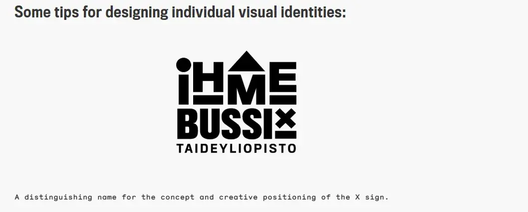
I like how the style guide gives a feeling that’s more of a creative branding album than a traditional marketing guide. It shows you dozens of contexts in which you’d see this school’s provocative logo, including animations.

The guide also gives tips on how to design visual identities using their symbols. Here’s an example:
Also, I really love how the text guide focuses on minor details that hold a lot of value. An example is:
“Put the person first, not their specific quality: e.g., people with disabilities (not disabled people), people who are homeless (not homeless people).”
This shows a deep commitment to inclusive and respectful language. I am of the opinion that all style guides should use communication that is thoughtful and considerate.
27. Western Athletic Conference
See the full Western Athletic Conference brand guide.
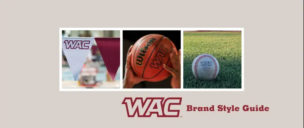
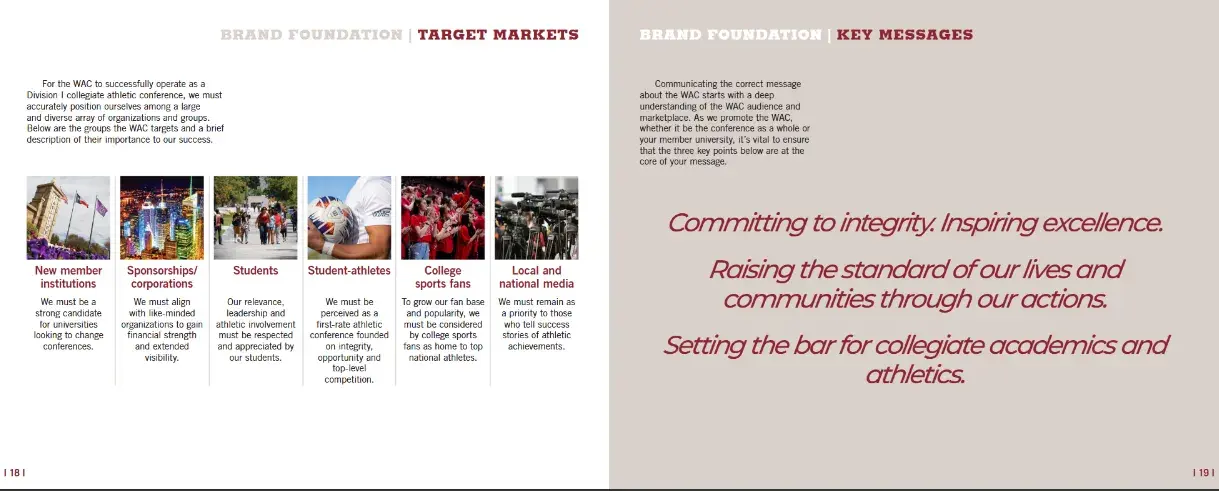
What I like: The Western Athletic Conference’s brand style guide includes extensive information about its history, mission, and vision. It also highlights its member universities, athletic championships, and awards it is involved with.
As I mentioned earlier, a brand guide is a powerful tool for communicating key messages effectively. The WAC brand guide does this exceptionally well by clearly outlining its target markets and core messaging. I think this is a reliable way to ensure consistency across all branding efforts.
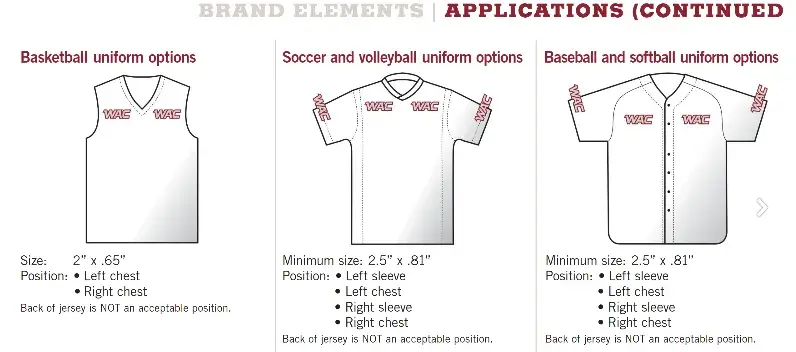
I like how the guide shows how the brand elements should be applied, illustrating their representation on uniforms and sports jerseys.
28. Discord
See the full Discord brand guide.
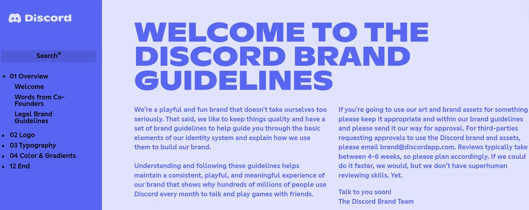
What I like: Discord’s brand style guide is as colorful and playful as the communities it serves. The brand’s motion elements are based on the dot, which represents the Discord user interacting with others in the communities it belongs to.
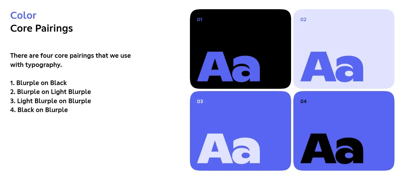
I appreciate how Discord has come up with its very own names for colors. Blurple is a memorable name that adds personality to the brand while keeping the guidelines engaging.
I also like how the brand guidelines talk about symbol scalability — something that’s often overlooked but incredibly important.
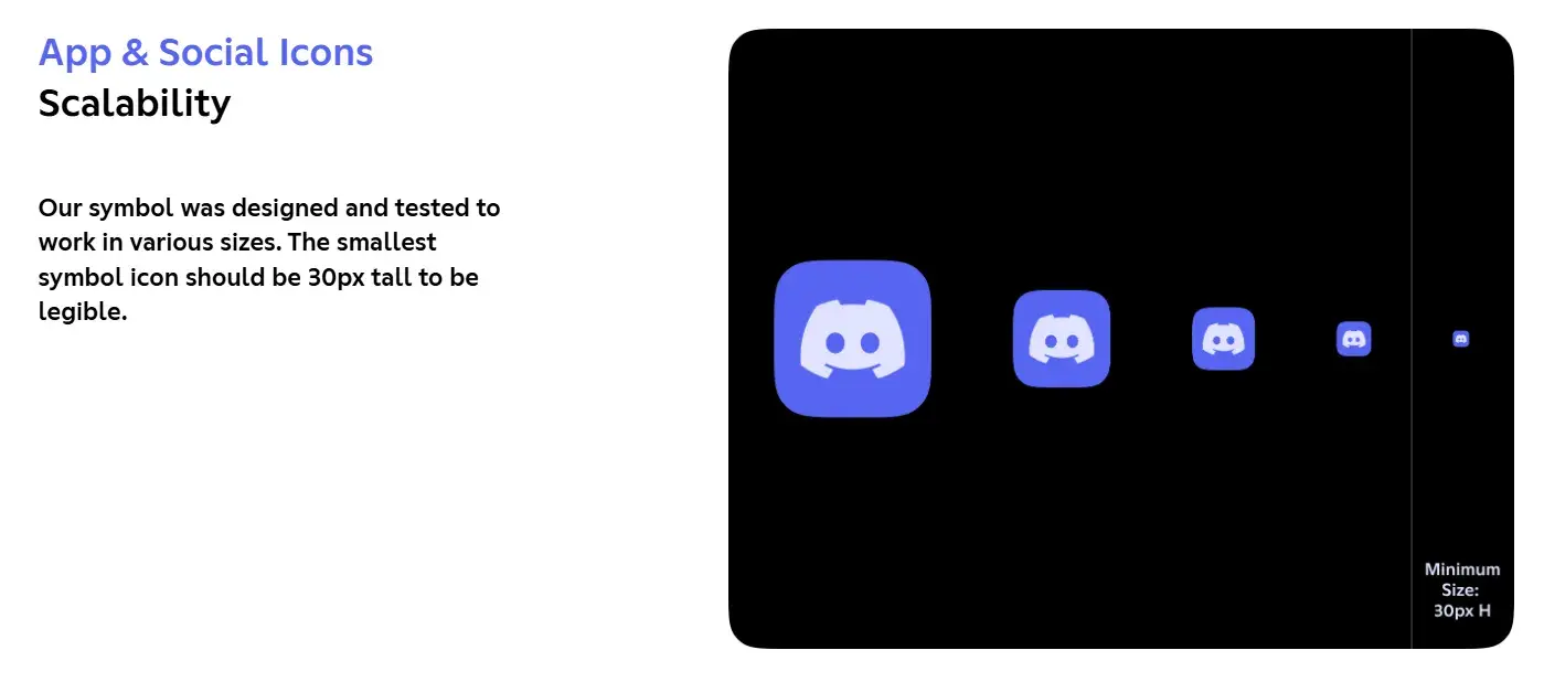
Also, they have included examples of incorrect symbol usage, making it easy to understand what to avoid. It’s a well-thought-out guide that ensures consistency while still allowing room for creativity.
29. NASA
See the full NASA brand guide.
What I like: NASA’s brand guidelines are one of the most comprehensive style guides I have come across. It describes countless logo placements, color uses, and supporting designs. The branding rules are quite varied. For instance, NASA’s space shuttles have their own branding rules.
The guide talks about supporting elements like typography, imagery, and even the specific proportions required for logo placement, ensuring every visual detail aligns with NASA’s identity. Their insignia has four variations, as shown below.

The details about what background colors to use are also well-defined.

I appreciate how it covers different contexts, from digital applications to physical branding on spacecraft and uniforms.
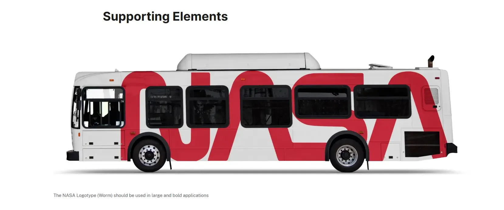
I really admire the level of precision, as nothing is left to chance. Even historical elements, like the use of the iconic “worm” and “meatball” logos, are carefully outlined, preserving NASA’s legacy while maintaining a modern, cohesive brand presence.
30. New York City Transit Authority
See the full New York City Transit Authority brand guide.
What I like: Like NASA, the NYCTA has its own graphics standards manual, and it includes some fascinating typography rules for the numbers, arrows, and public transit symbols the average commuter takes for granted every day.
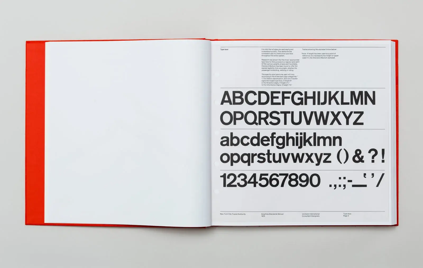
The guide ensures clarity and consistency in the smallest details. For instance, look at the combination of arrows and how it displays directional information.
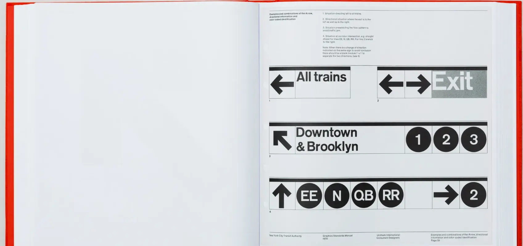
The brand guide preserves the visual identity of New York’s transit system while allowing for practical usability. Here’s a page that defines how the line map should be demonstrated.
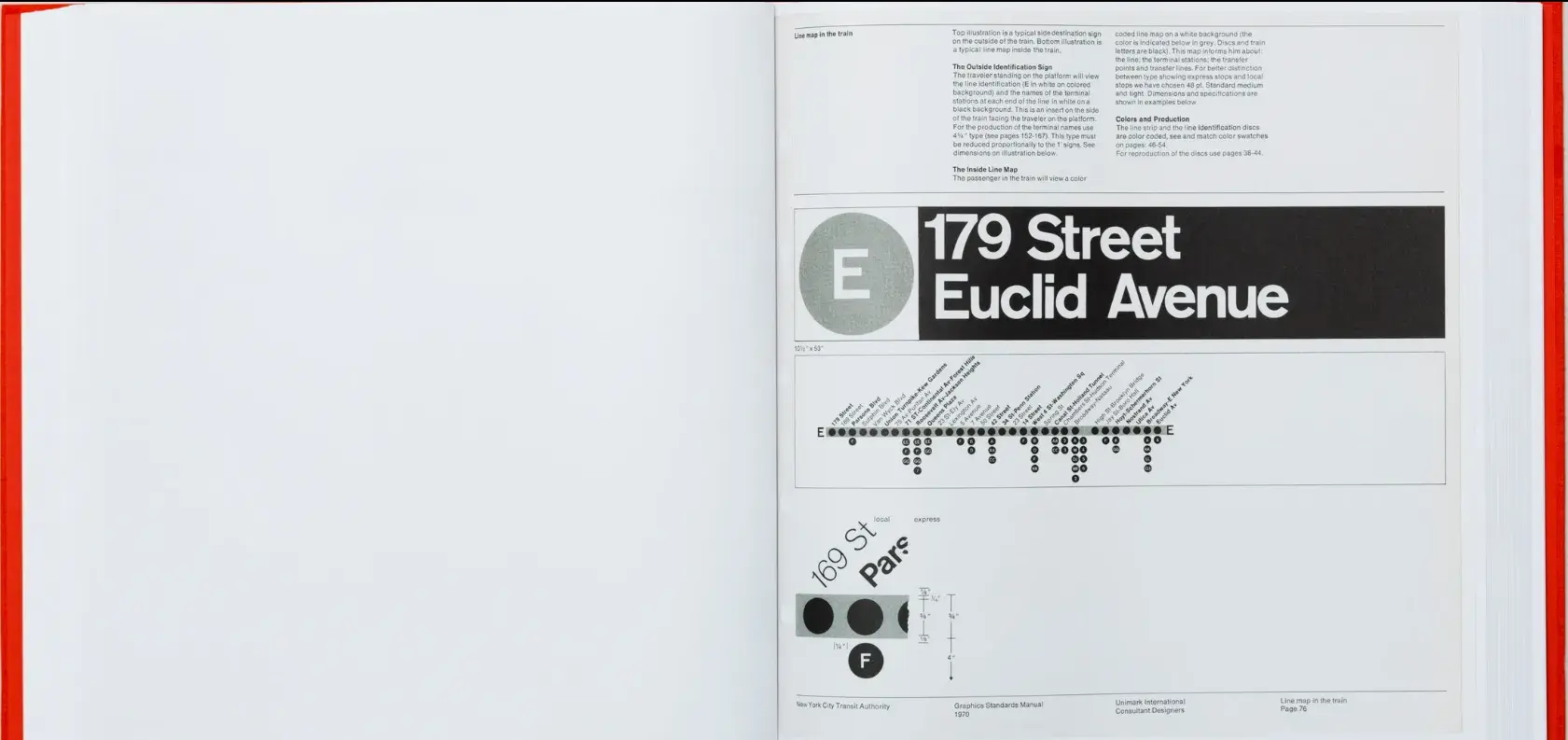
It’s a perfect example of how thoughtful design can enhance everyday experiences without people even realizing it.
Branding Guidelines Tips
If you want to take your branding style guide to the next level, my suggestion would be to let HubSpot’s Brand Kit Generator do some of the heavy lifting for you.
I’d also recommend following the best practices below, which the HubSpot Creative team has used to disseminate branding information to the rest of the HubSpot Marketing team.
This has made my job as a blogger easier and allows our brand to feel well thought-out and cohesive.
1. Make your guidelines a branded document.
Whether you’re publishing your branding guidelines online or creating an internal presentation, consider making the guidelines themselves a branded document.
Ensure the published document follows your established brand voice, uses the symbols and imagery you’ve created, and employs the colors and typography that make your brand feel like you.
Insights from HubSpot’s Creative Team
When our Creative team rolled out a visual identity refresh for the HubSpot brand, we all received access to a branded playbook that summarized all the changes and described how we should represent HubSpot online moving forward.
Not only was I a huge fan of the refresh, but also of the way it was presented to our team in a branded document.
You can do the same, regardless of your budget. Our Creative team actually used a free tool, Google Slides — so it’s totally doable for a small or freelance brand!
2. Name your brand’s colors.
You’ve already chosen your color palette — why not go as far as naming the colors?
Giving your colors unique names (aside from “blue” or “orange”) can help you tie the tactical elements of your branding into an overall theme or ethos.
Not to mention that it’s awesome to be able to refer to company colors by a unique name. Imagine if we called Solaris, HubSpot’s primary brand color, “HubSpot Orange” — that simply doesn’t have the same ring.
Insights from HubSpot’s Creative Team
In our visual identity refresh, our Creative team brightened and intensified our color palette, then renamed the individual hues.
They wrote, “Every color, tint, and shade is based on central themes. […] Whether it’s a subway line in Paris or a flower-lined street in Japan, the secondary color names are a veritable tour of important cultural and geographical touchstones from HubSpotters all over the world.”
Think about what makes your brand unique and why you chose the colors that you did. For instance, if you work at a law firm that specializes in car accident cases, you might choose red as one of the brand colors and call it “Stop Light.”
3. Create easy-to-use branded templates.
Alongside your branding guidelines should be templates to empower your team to easily design branded assets, even if they’re not designers.
Insights from HubSpot’s Creative Team
At HubSpot, we keep all of our templates in our team’s Canva account. There, anyone (myself included) can edit pre-made designs for any number of use cases.
If you already have a HubSpot account, the good news is that HubSpot now directly integrates with Canva. If you don’t, well, I can say that you’re missing out on some real convenience!
For instance, as a writer on the HubSpot Blog, I have to create graphics to supplement the information I’m sharing. The branded templates made by our Creative team have made my work a great deal easier, and I can imagine that it’s the same for our Social Media team.
Not everyone is a designer, but with templates, you can ensure your brand looks professional no matter who creates an asset.
4. Ensure your branding is optimized for all channels.
Your branding guidelines should include different specifications for different channels.
Or, alternatively, you should have assets and designs that can be adjusted for various channels and media. Not only for sizing purposes, but for accessibility purposes, too.
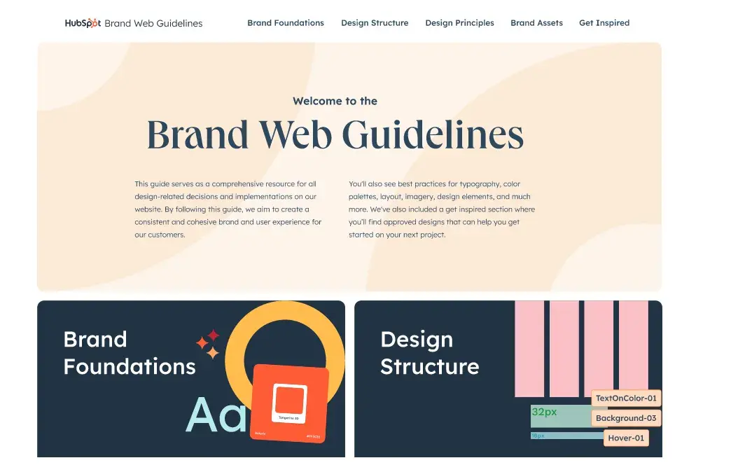
For instance, if you primarily market your brand over Instagram and on your website, then your branding should have web-accessible colors, as well as Instagram-friendly designs and sizes.
However, you don’t want to significantly change your branding from channel to channel. It should work relatively well, no matter where you’re marketing your brand.
Build a Memorable Style Guide of Your Own
Once you build your unique brand style guide, customers will recognize your brand and associate it with all the visual cues you want them to.
I hope this collection of standout brand style guides has provided valuable inspiration and insights. Remember that strong branding is not just about aesthetics. It’s about crafting a narrative that resonates. It’s also about building a cohesive identity that reflects your brand’s values, mission, and personality.
Best of luck in creating a timeless and impactful style guide for your brand!
Editor’s note: This post was originally published in January 2017 and has been updated for comprehensiveness.
![]()
from Marketing https://ift.tt/BJASOYT
via IFTTT
![Free Download: How to Create a Style Guide [+ Free Templates]](https://no-cache.hubspot.com/cta/default/53/76520ae5-1a3b-4055-9e8e-95e150b90965.png)